Your customers are on their phones right now. Whether they’re checking in at an event, submitting feedback, or signing a contract, mobile devices have become the primary touchpoint for digital interactions. Yet many organizations still design electronic form with desktop users in mind, then scramble to make them “mobile-friendly” as an afterthought.
This approach is costly. Poorly optimized mobile forms create frustration, leading to high abandonment rates. The solution? Embracing mobile-first design principles that prioritize the smallest screen first, ensuring seamless experiences that actually convert across all devices.
In this guide, we’ll explore how mobile-first electronic form can simplify data collection, reduce errors, and improve completion rates.
The Mobile Revolution in Electronic Form Usage
Did you know that 73% of users now complete electronic forms on mobile devices, according to recent mobile usage statistics. This shift isn’t just about convenience, it’s fundamentally changing how people interact with digital documentation and data collection forms.
Mobile-first indexing has also transformed form discoverability. Search engines now prioritize mobile-optimized content, meaning your electronic form design directly impacts whether people can find it. Additionally, user behavior differs dramatically between platforms: mobile users expect instant loading, minimal typing, and intuitive navigation designed for thumbs, not cursors. The stakes are higher than ever. Clunky form templates cost you leads, registrations, and revenue.
7 Mobile UX Principles for Electronic Form
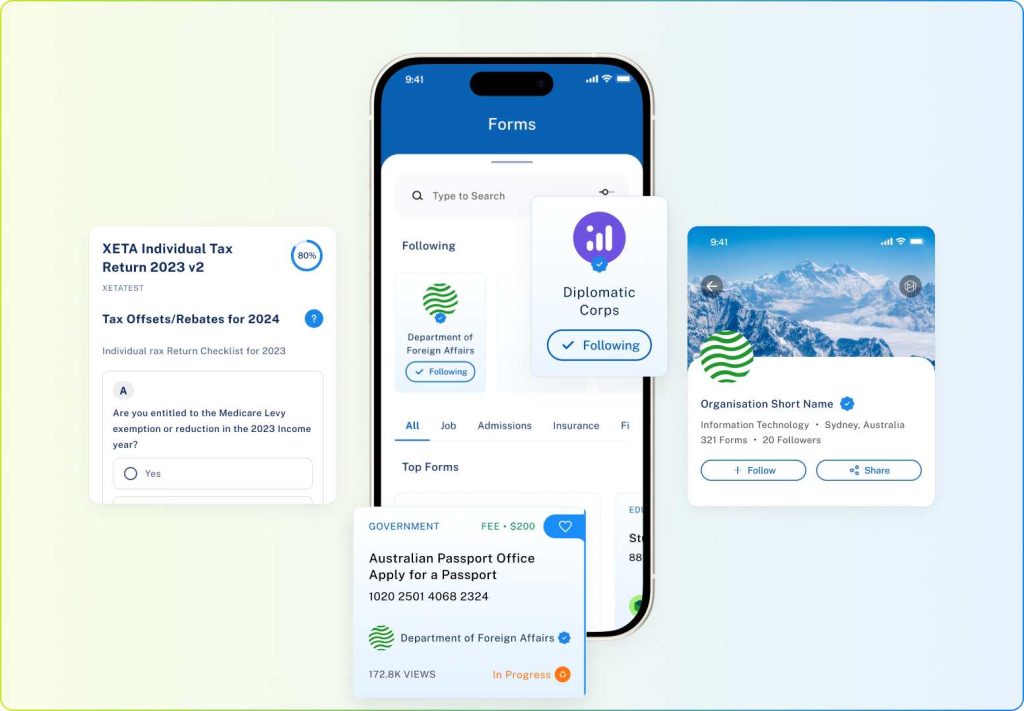
Designing a mobile-friendly electronic form involves more than resizing fields. It’s about understanding how users interact with their devices.
- Use Progressive Disclosure: Break long forms into short, step-by-step sections to reduce overwhelm. Instead of overwhelming users with 20 fields at once, reveal questions progressively. This approach reduces cognitive load by 40% and dramatically improves completion rates for data collection forms.
- Touch-Friendly Fields: Design buttons and form fields with generous tap targets, at least 44×44 pixels, according to Apple’s Human Interface Guidelines. Cramped interfaces lead to misclicks and frustration, especially for users with larger fingers or accessibility needs.
- Smart Keyboard Optimization: Trigger the right keyboard for each field type in your electronic form. Email fields should display the @ symbol prominently, phone numbers should open numeric keypads, and date fields should use native date pickers. These small touches eliminate friction and reduce input errors by 35%.
- Autofill Integration: Leverage device data and password autofill to populate fields automatically. This simple technique positions your electronic form for higher completion rates. Explore Paxform’s document management features that automatically sync form data across your entire workflow.
- Thumb-Zone Awareness: Position critical actions (Next, Submit) within easy reach of one hand. Research from Steven Hoober’s mobile UX studies shows 49% of users hold phones one-handed. Your electronic form must accommodate this reality.
- Fast Loading: Keep load times under 3 seconds to prevent drop-offs. Every additional second increases abandonment rates by 7%. Compress images, minimize scripts, and prioritize above-the-fold content.
- Offline Sync: Ensure users can fill out forms without internet access, especially valuable for event check-ins or fieldwork. Progressive Web App (PWA) technology makes this seamless.
Common Mobile Form Mistakes That Kills Conversion
Even well-intentioned digital forms can miss the mark. Avoid these pitfalls that hurt engagement and accuracy:
- Tiny fields and small buttons: This forces users to zoom and pan awkwardly, an instant frustration trigger.
- Too many required fields: Excessive required fields, especially on mobile forms, cause cognitive fatigue and abandonment within 40 seconds.
- Poor error messages: The placement hides validation feedback below the keyboard, leaving users confused about what went wrong when they try to fill out form fields.
- Desktop-first design: Forms that don’t scale down properly create the worst experience: horizontal scrolling, overlapping elements, and buttons that disappear off-screen.
These issues are entirely preventable with mobile-first thinking and proper form templates. A well-structured electronic form minimizes cognitive load, allowing users to focus on completing, not struggling with, the process.
Want to see how your current forms perform? Start a free trial on Paxform to test your mobile readiness.
QR Code Integration: Bridging Physical and Digital
QR codes have evolved from pandemic necessity to mainstream convenience. They provide instant access to your electronic form without app downloads or URL typing, perfect for event check-ins, product registrations, and on-site data collection forms.
Real-World Use Cases Across Industries
Retail staff scan QR codes to access inventory forms and customer feedback surveys. Event attendees check in seamlessly using their mobile form access, eliminating paper sign-in sheets. Service technicians submit field reports instantly with pre-filled job data.
Healthcare facilities use QR-enabled electronic forms for patient intake, reducing wait times by 45%. Educational institutions deploy them for permission slips, attendance tracking, and parent communication, all mobile-first.
The key is ensuring the destination electronic form loads under 2 seconds and works flawlessly on any device. Discover Paxform’s workflow automation that integrates QR check-in with your existing systems.
Implementation Best Practices
Place QR codes at eye level in physical spaces. Test scanning from 3-6 feet away with multiple devices. Include a shortened URL beneath the code as a fallback option.
Dynamic QR codes allow you to update the destination electronic form without reprinting materials, essential for recurring events or seasonal campaigns.
Testing and Optimizing Your Mobile Electronic Forms
Optimization is an ongoing process, not a one-time fix. Implement A/B testing to compare different layouts, button placements, and field sequences in your data collection forms. Small changes yield big results, moving a CTA button 50 pixels can improve conversions by 20%.
Key Metrics to Track
Monitor completion rate (started vs. finished), time-on-form (target under 90 seconds for simple forms), and specific drop-off points. These metrics reveal exactly where users struggle with your electronic form.
Track by device type and operating system. Android users might experience different issues than iOS users. Older devices with smaller screens often show problems invisible on flagship phones.
How Mobile-Responsive Templates Eliminate Guesswork
Platforms like Paxform eliminate guesswork with pre-tested, mobile-responsive form templates that work reliably across all devices. Every template includes optimized field sizing, smart validation, and autofill integration, no coding required.
Request a Paxform demo to see how our mobile-first electronic forms boost your completion rates by an average of 3x.
Building Better Mobile Experiences That Convert
Mobile-first design isn’t just a trend, it’s the future of electronic forms. By combining strong UX principles, real-time automation, and intuitive mobile experiences, organizations can reduce manual errors, improve form completion, and accelerate decision-making.
The organizations winning recognize that form completion is a critical conversion moment worth optimizing. Every unnecessary tap, confusing field, or slow load time pushes users toward abandonment and into competitors’ systems. Your electronic form is often the first meaningful interaction customers have with your brand, make it count.
Start with the 7 UX principles outlined above, eliminate common mistakes, and leverage modern tools that handle technical complexity for you.
Contact our team to learn how Paxform streamlines your entire workflow, from data collection forms to document management to contract signatures, all optimized for mobile-first experiences that convert.